Data Visualisation using ggplot
Learning Objectives
- Create simple scatterplots, histograms, and boxplots in R.
- Compare the plotting features of base R and the ggplot2 package.
- Customize the aesthetics of an existing plot.
- Create plots from data in a data frame.
- Export plots from RStudio to standard graphical file formats.
Basic plots in R
The mathematician Richard Hamming once said, “The purpose of computing is insight, not numbers”, and the best way to develop insight is often to visualise data. Visualisation deserves an entire lecture (or course) of its own, but we can explore a few features of R’s plotting packages.
When we are working with large sets of numbers, it can be useful to display that information graphically. R has several built-in tools for basic graph types such as histograms, scatter plots, bar charts, boxplots and much more. We’ll test a few of these out here on the genome_size vector from our metadata.
genome_size <- metadata$genome_size
Scatterplot
Let’s start with a scatterplot. A scatter plot provides a graphical view of the relationship between two sets of numbers. We don’t have a variable in our metadata that is a continuous variable, so there is nothing to plot it against, but we can plot the values against their index values just to demonstrate the function.
plot(genome_size)
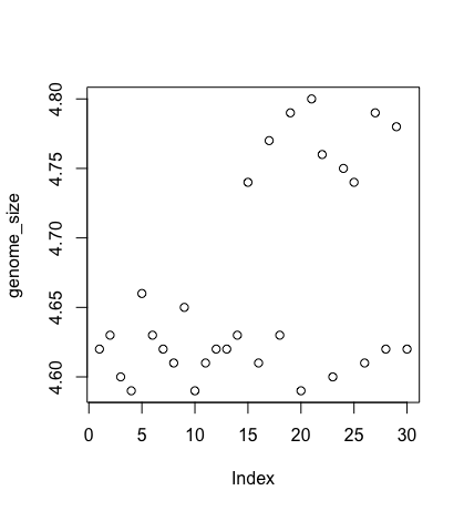
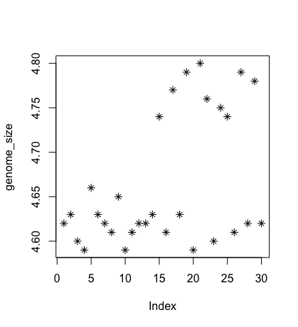
Each point represents a clone, and the value on the x-axis is the clone index in the file, where the values on the y-axis correspond to the genome size for the clone. For any plot, you can customise many features of your graphs (fonts, colours, axes, titles) through graphic options. For example, we can change the shape of the data point using pch.
plot(genome_size, pch=8)
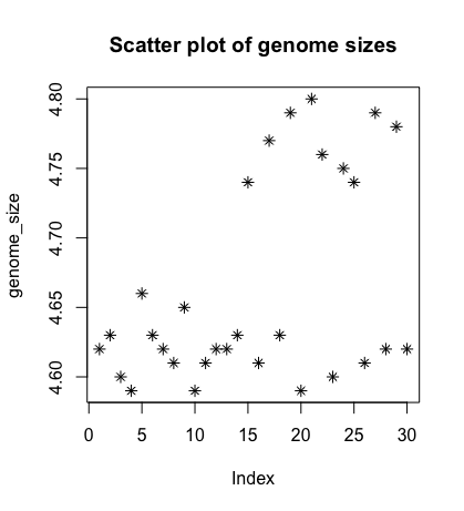
We can add a title to the plot by assigning a string to main:
plot(genome_size, pch=8, main="Scatter plot of genome sizes")
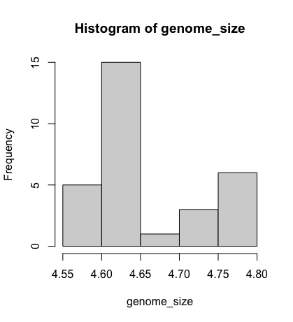
Histogram
Another way to visualise the distribution of genome sizes is to use a histogram. We can do this by using the hist function:
hist(genome_size)
Boxplot
Using additional information from our metadata, we can use plots to compare values between the different citrate mutant status using a boxplot. A boxplot provides a graphical view of the median, quartiles, maximum, and minimum of a data set.
    # creating a boxplot
    cit <- metadata$cit
    boxplot(genome_size ~ cit, metadata)
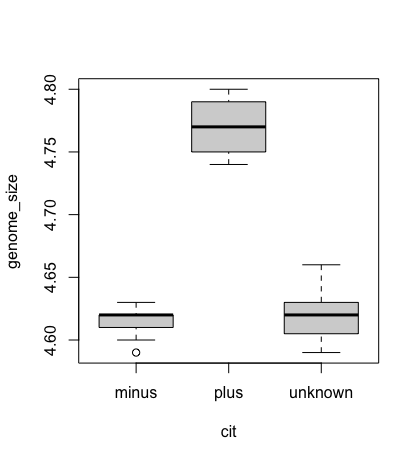
However, these are really ugly plots, so we are going to facilitate using ggplot and other packages to improve visualisation.
Hint: For more options for boxplots please explore here. Or use the R gallery to visualise what plot you would like and some example code to adapt.
Advanced figures (ggplot2)
More recently, R users have shifted away from base graphic options and toward a plotting package called ggplot2, which adds significant functionality to the basic plots seen above. The syntax takes some getting used to but it’s extremely powerful and flexible. We can start by re-creating some of the above plots but using ggplot functions to get a feel for the syntax.
ggplot2 is best used on data in the data.frame form, so we will work with metadata for the following figures. Let’s start by loading the ggplot2 library.
library("ggplot2")
The ggplot() function is used to initialise the basic graph structure, and then we add to it. The basic idea is that you specify different parts of the plot and add them together using the + operator.
We will start with a blank plot and add layers as we progress.
ggplot(metadata)
Geometric objects are the actual marks we put on a plot. Examples include:
- points (
geom_point, for scatter plots, dot plots, etc) - lines (
geom_line, for time series, trend lines, etc) - boxplot (
geom_boxplot, for, well, boxplots!)
A plot must have at least one geom; there is no upper limit. You can add a geom to a plot using the + operator
    ggplot(metadata) +
      geom_point()
Each type of geom usually has a required set of aesthetics to be set, and usually accepts only a subset of all aesthetics – refer to the geom help pages to see what mappings each geom accepts.
Aesthetic mappings are set with the aes() function. Examples include:
- position (i.e., on the x and y axes)
- colour (“outside” colour)
- fill (“inside” colour) shape (of points)
- line type
- size
To start, we will add the column names that correspond to the variable we want to set for the x- and y-values.
geom_point requires arguments for x and y, all other arguments are optional.
We will run the most basic scatterplot of sample against genome size.
    ggplot(metadata) +
      geom_point(aes(x = sample, y= genome_size))
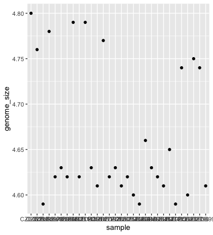
The problem is that the labels on the x-axis are quite hard to read. To change this, we need to add a theme layer. The ggplot2 theme system handles non-data plot information such as:
- Axis labels
- Plot background
- Facet label background
- Legend appearance
We have built-in themes to use, or we can adjust specific elements.
For our figure, we will change the x-axis labels to be plotted on a 45-degree angle with a small horizontal shift to avoid overlap.
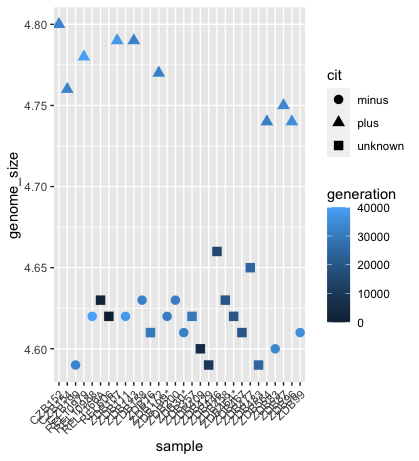
We will also add some additional aesthetics by assigning them to other variables in our dataframe.
For example, the colour of the points will reflect the number of generations and the shape will reflect citrate mutant status. The size of the points can be adjusted within the geom_point but does not need to be included in aes() since the value is not assigned to a variable.
    ggplot(metadata) +
      geom_point(aes(x = sample, y= genome_size, color = generation, shape = cit), size = rel(3.0)) +
      theme(axis.text.x = element_text(angle=45, hjust=1))
Histogram
To plot a histogram, we require another geometric object, geom_bar, which requires a statistical transformation. Some plot types (such as scatterplots) do not require transformations; each point is plotted at x and y coordinates equal to the original value. Other plots, such as boxplots and histograms, as well as prediction lines, require transformation and typically have a default statistic that can be modified via the stat_bin argument.
    ggplot(metadata) +
      geom_histogram(aes(x = genome_size))
Could you try plotting with the default value and compare it to the plot using the binwidth values? How do they differ?
    ggplot(metadata) +
      geom_bar(aes(x = genome_size), stat = "bin", binwidth=0.05)
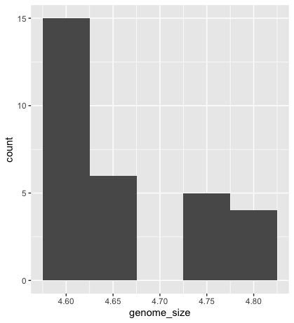
Please explore the different options found on the cheatsheet
Exercise
Go to the R Gallery. Choose your favourite histogram. Change the colour of the histogram to red. Should this be within the
aes()function, or outside?Hint Look at the cheatsheet
Boxplot
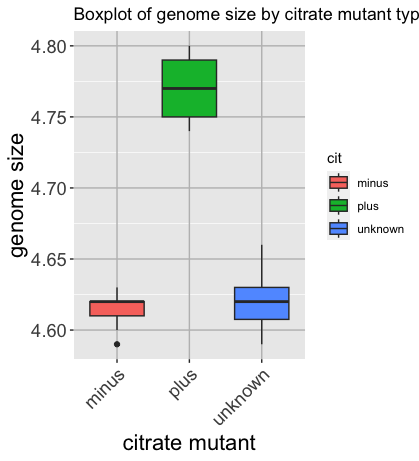
Now that we have all the required information, let’s try plotting a boxplot similar to what we had done using the base plot functions at the start of this lesson.
We can add some additional layers to include a plot title and change the axis labels.
Please take a look at the code below and the various layers we have added to understand the contributions of each layer to the final graphic.
    ggplot(metadata) +
      geom_boxplot(aes(x = cit, y = genome_size, fill = cit)) +
      ggtitle('Boxplot of genome size by citrate mutant type') +
      xlab('citrate mutant') +
      ylab('genome size') +
      theme(panel.grid.major = element_line(color = "grey"),
              axis.text.x = element_text(angle=45, hjust=1),
              axis.title = element_text(size = rel(1.5)),
              axis.text = element_text(size = rel(1.25)))
Exercise
Check out other options using the r-graph gallery.
Writing figures to a file
There are two ways in which figures and plots can be output to a file (rather than simply displaying on screen). The first (and easiest) is to export directly from the RStudio ‘Plots’ panel, by clicking on Export when the image is plotted. This will give you the option of png or pdf and selecting the directory to which you wish to save it to.
The second option is to use R functions in the console, allowing you the flexibility to specify parameters to dictate the size and resolution of the output image. Some of the more popular formats include pdf(), png(), which are functions that initialise a plot that will be written directly to a file in the pdf or png format, respectively. Within the function, you will need to specify a name for your image in quotes and the width and height. Specifying the width and height is optional, but can be very useful if you are using the figure in a paper or presentation and need it to have a particular resolution. Note that the default units for image dimensions are either pixels (for png) or inches (for pdf). To save a plot to a file, you need to:
- Initialise the plot using the function that corresponds to the type of file you want to make:
pdf("filename") - Write the code that makes the plot.
- Close the connection to the new file (with your plot) using
dev.off().
    pdf("figure/boxplot.pdf")

    ggplot(example_data) +
      geom_boxplot(aes(x = cit, y =....) +
      ggtitle(...) +
      xlab(...) +
      ylab(...) +
      theme(panel.grid.major = element_line(...),
              axis.text.x = element_text(...),
              axis.title = element_text(...),
              axis.text = element_text(...)

    dev.off()
Exercise
Make the ugliest plot you can! Hint: if you can make it uglier than Katherine’s favourite graph, I will be impressed
Integrating statistical tests into your plot
Utilise ggpubr to make it easier to interact with ggplot and integrate statistics. Different statistical tests are appropriate depending on the number of groups and the distribution of the data within the groups.
This isn’t a statistics class, so we won’t cover all available methods. However, we’ll walk through the logic for choosing a suitable test for this dataset.
Step-by-step: Choosing the appropriate test:
-
Data type. i. genome_size is numeric. ii. cit is a categorical variable with three levels: “plus”, “minus”, and “unknown”.
-
What are we comparing? i. We’re interested in whether genome size differs between citrate-utilisation groups (cit status). ii. We will perform pairwise comparisons: “minus” vs “plus”, “unknown” vs “plus” and “minus” vs “unknown”.
-
Group sizes. These are relatively small sample sizes.
table(metadata$cit)
minus plus unknown
9 9 12
- Data distribution and normality. While formal normality tests (e.g., shapiro.test() or ks.test()) can be used, small sample sizes and the presence of tied values (e.g., repeated 4.62, 4.63) already suggest that the data likely violate normality assumptions. The standard deviations are small, and visual inspections show limited spread within each group.
Choosing the test because:
- The data are numeric
- The group sizes are small
- There are tied values and limited variance
- And we are comparing group medians across pairs of groups.
We choose the Wilcoxon rank-sum test (a non-parametric alternative to the t-test) for pairwise comparisons. For testing across all three groups simultaneously, we would use the Kruskal–Wallis test; however, that’s not necessary here, as we’re interested in pairwise differences.
For visualisation, you’ll need to install the ggubr package, load it into your library, and plot your boxplot.
    # Install and load ggpubr
    install.packages("ggpubr")
    library(ggpubr)

    # Visualise with a boxplot
    p <- ggboxplot(metadata, x = "cit", y = "genome_size",
                   color = "cit",
                   palette = c("#4D00C7", "#DA3C07", "#05D3D3", "#C6C7C5"),
                   add = "jitter", shape = "cit") +
         xlab("Citrate Mutant") + ylab("Genome Size (Mb)")

    # Define pairwise comparisons
    my_comparisons <- list(
      c("unknown", "minus"),
      c("unknown", "plus"),
      c("minus", "plus")
    )

    # Add Wilcoxon test results with significance labels
    p + stat_compare_means(
          comparisons = my_comparisons,
          method = "wilcox.test",
          aes(label = after_stat(p.signif)),
          exact = FALSE  # avoid warning with ties
      )
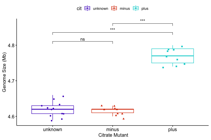
You might get a warning:
Warning messages:
1: In wilcox.test.default(...):
  cannot compute exact p-value with ties
This occurs because the Wilcoxon rank-sum test (also called the Mann–Whitney U test) attempts to compute an exact p-value by default. However, this method assumes that all values are unique. When your data contains tied values—as is the case here with repeated measurements like 4.62 and 4.63—the exact method is no longer valid. In such cases, the test automatically switches to an approximate method (based on a normal approximation) and raises this warning.
Resources:
We have only scratched the surface here. To learn more, see the ggplot2 reference site, and Winston Chang’s excellent Cookbook for R site.
Though slightly out of date, ggplot2: Elegant Graphics for Data Analysis is still the definitive book on this subject. Much of the material here wasadaptedd from Introduction to R graphics with ggplot2 Tutorial at IQSS.
To investigate more into colour palettes viridis
Material adapted from (https://datacarpentry.org/R-genomics/01-intro-to-R.html) and (https://datacarpentry.org/semester-biology/materials/r-intro/)
Data Carpentry, 2017-2018. License. Contributing.